Dynamic Pareto Chart in Power BI In this post I want to share my technique of building a dynamic Pareto Chart. Pareto charts are used to show the 80/20 rule according to which roughly 80% of
Tag Archives: charts
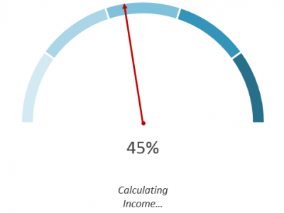
Gauge Charts A gauge chart should be used sparingly, especially in professional reports or dashboards when much better alternatives are available (bullet charts come to mind). In spite of that, it is a good Excel
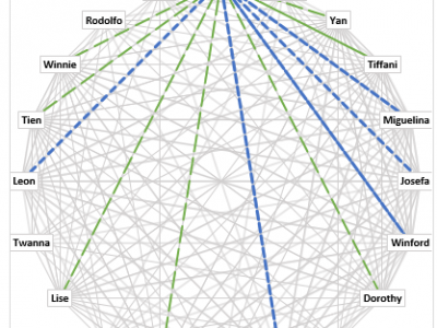
Excel People Connections Chart Download the file Suppose you have one table like the below which lists the relationship between two people: 0 No Relationship, 1 they just knows each other, 2 they are good
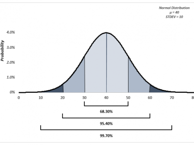
The NORM.DIST Function Download the file The NORM.DIST function, as its name implies, returns the normal distribution (continuous probability function) given the mean and the standard deviation of your observations. The NORM.DIST function can return
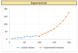
Excel Forecast Charts In the paragraphs below I will show how to calculate the different types of trendlines available in Excel charts: Linear, Exponential, Logarithmic, Polynomial, Power. Download the Excel file Given a data set
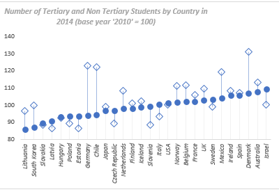
The Data While browsing the internet looking for students data, I stumbled upon one chart on the OECD website which was plotting number of students by Country divided between tertiary and non tertiary sectors. In

Excel Marimekko Charts Excel Marimekko Charts are a great way of displaying market or sales data for different companies competing in the same sectors. Download the file Imagine you had the following data: You have

Scatter Chart for Countries Education Performance I found some interesting data on the OECD website ranking Countries Education Performance of 15 years old from one year to another which I thought would make an interesting