The Data
While browsing the internet looking for students data, I stumbled upon one chart on the OECD website which was plotting number of students by Country divided between tertiary and non tertiary sectors. In the following paragraphs I will try to replicate the chart suggested by the website plus some alternatives solutions (Excel Dot Plots, Tornado Charts & more). You can download the file here: Students Graphs
The OECD Chart
I have replicated in Excel the chart proposed on the website:
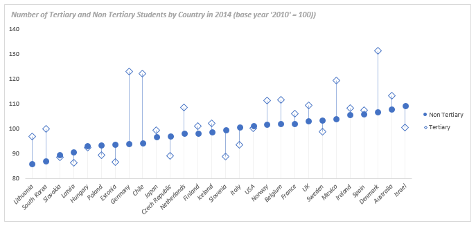
The above chart is built using two lines with markers series (lines hidden). The blue bars are simply “High-Low” lines added to the chart (Select the series, go to the Design Tab and then Add Chart Element), whereas for the light gray lines I have used error bars. I have sorted the data by Non Tertiary Education.
Excel Dot Plots
A first alternative to the above graph would be using Dot Plots:
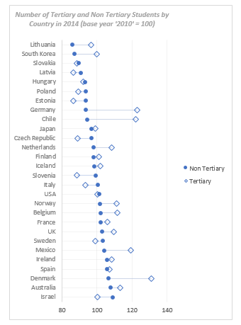
Excel Dot Plots
The main advantage of transposing the data is the readability of the Country labels which are now displayed horizontally. The above chart has been built using a bar chart as a base to which I have added two XY scatter series connected by Error Bars.
Tornado Chart
Another alternative would be using a Tornado Chart:
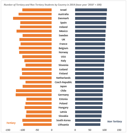
Excel Tornado Chart
The above chart would not be my first choice. It is not so obvious to see the difference between sectors and it takes more steps to build compared with the previous two charts.
Bar Charts
A fourth option would be using bar charts:
Excel Bar Chart
The above chart was built plotting one series on the primary axis (no borders and light fill) and another on the secondary axis (no fill and black border).
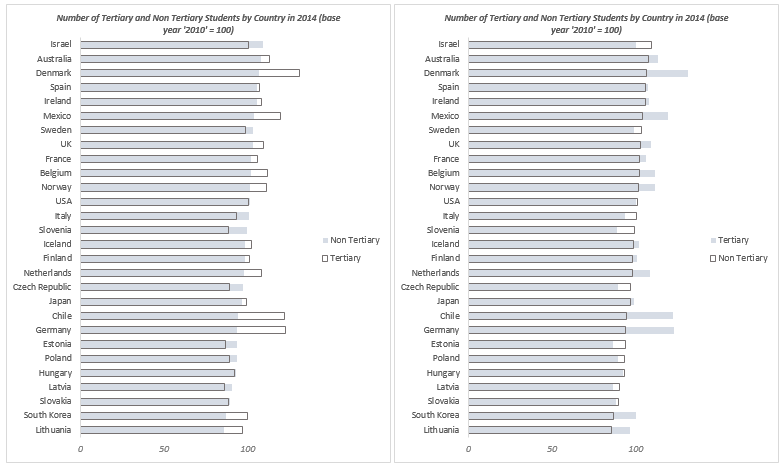
Panel Chart to show changes between periods
Since our data has a value of reference (value of 100 for 2010), we can build a panel line chart to show the change between 2010 and 2014:
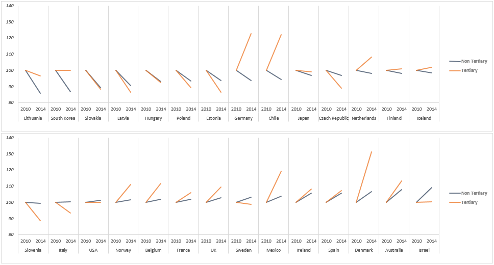
Excel Panel Chart
Given the amount of Countries, I have made two charts and placed them on top of each other.
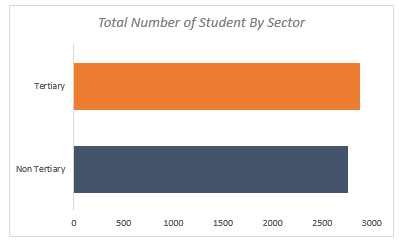
Other Insights
From the data you may also want to know the total number of students by sector:
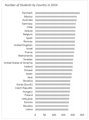
Or the Country with most students overall:
Excel Bar Chart
These are a few examples of the different charts that can be used to compare such data. Feel free to post more ideas in the comments below.