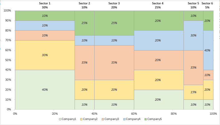
Excel Marimekko Charts
Excel Marimekko Charts are a great way of displaying market or sales data for different companies competing in the same sectors.
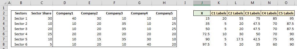
Imagine you had the following data:
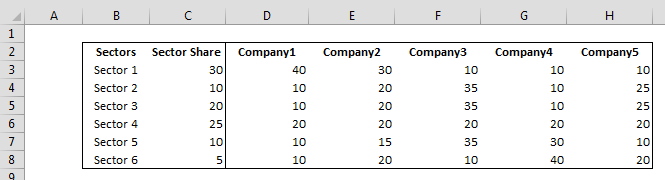
Excel Marimekko Chart
You have five different companies competing in six sectors. Column C represents how big each sector as a percentage of total (the sum is 100). In Row 3 is the share of each company in Sector 1 (summing up to 100), Company A has the biggest share of Sector 1 with 40. The same goes for the other rows from 4 to 8.
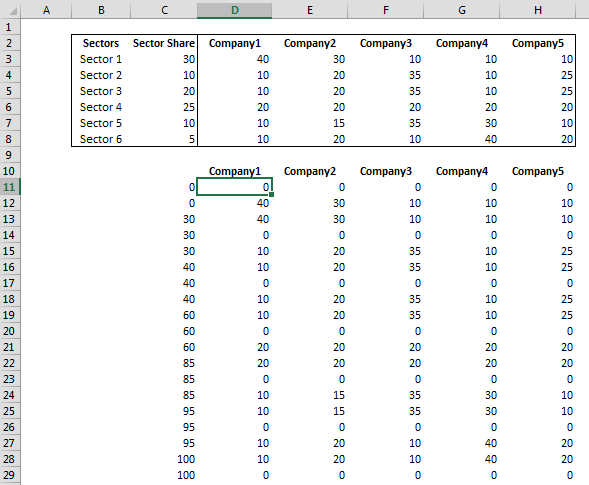
Rearranging the Data
Our final goal is to create a stacked area chart where on the horizontal Axis is plotted the size of each sector and on the vertical axis the size of each company in each sector. The rearranged data is below:
Excel Marimekko Charts
In D11 I have placed the following formula and I dragged it down to row 29 and across:
=IF(MOD(ROWS(D$11:D11)-1,3)=0,0,INDEX(D$3:D$8,QUOTIENT(ROWS(D$11:D11)-1,3)+1))
This will create a 3 values sequence, where the first value is always 0 and the second and third values for the first sequence is the size of Company A in Sector1, then the size of Company A in Sector B and so son.
In C11 and C12 I have hard coded two zeros and then in C13 I have used the following formula:
=INDEX(SUBTOTAL(9,OFFSET($C$3,0,0,ROW($C$3:$C$8)-ROW($C$3)+1,1)),QUOTIENT(ROWS(C$13:C13)-1,3)+1,1)
The part: SUBTOTAL(9,OFFSET($C$3,0,0,ROW($C$3:$C$8)-ROW($C$3)+1,1)) is creating a running total of the sectors shares and the INDEX is repeating each value 3 times.
Adding the Chart
Once we are at this stage the heavy work is done. Select C10:D29 and add a Stacked Area chart. The chart you get by default is this:
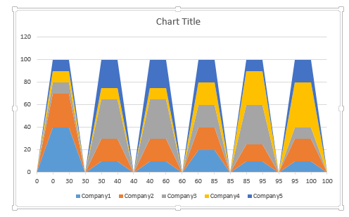
Excel Marimekko Charts
The issue is that the horizontal axis is currently a category axis where each value is being treated as a category and not as a number. Select the Axis and change to Date Axis. Set the units major to 20 and adjust the max of the vertical axis to 100.
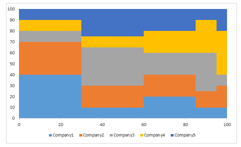
Excel Marimekko Charts
It is starting to look much better. The next step is to place data labels inside each area in order to show the market share of each company. To do this, we will create the following series and add it as a XY scatter chart:
Excel Marimekko Charts
In J3 I have used the used the following formula and dragged it down:
=C3/2+SUM(C$2:C2)
In K3 and dragged down:
=D3/2
And in L3 and dragged down and across:
=E3/2+SUM($D3:D3)
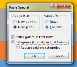
Select J2:O8, copy it, select the chart and choose paste special:
Excel Marimekko Charts
Then change each series to a XY scatter Chart (make sure they stay on the primary axis, Excel will change it automatically to the secondary axis). Make the filling of the area chart less aggressive and add light borders to distinguish each area.
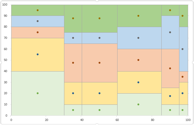
Excel Marimekko Charts
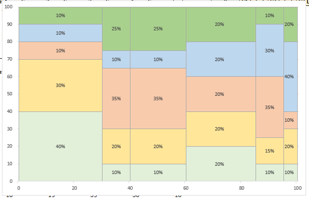
Select each of the XY Series, Add Data Labels, then choose Center for labels position and hide the markers. Then select the labels for each series, choose Add Values From Cells and for the series named C1 choose the range D3:D8, for the series named C2 choose the range E3:E8 and so on. Then custom number format the range D3:H8 to 0″%“
Excel Marimekko Charts
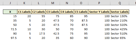
Now we will add the labels for the sector. We will add another XY Series where as X values it will have the values we already calculated in J3:J8, and as Y values we will use P3:P8 where I have hard coded 100 in each cell. Select J3:J8 then with CTRL pressed select P3:P8, copy, select the chart and choose past special as we did earlier. Change it to XY scatter and move it on the primary axis. Then add Data Labels, position them Above this time, and select values from cells and then choose as range Q3:Q8. Hide the market and make the plot area a little bit shorter. In Range Q3:Q8 I have used the following formula: =B3&CHAR(10)&TEXT(C3,”0″”%”””)
Excel Marimekko Charts
Excel Marimekko Charts
Now the charts clearly shows the dominant Company for each sector. You may update the formatting as you prefer, maybe you can add company names inside each area and get rid of the legend. As we have used formulas to calculate all needed series, the chart will update whenever you update range C3:H8, when you update these values you need to make sure that the percentages are still respected, C3:C8 needs to sum up to 100 and so does each row D3:H3 to D8:H8.