Gauge Charts
A gauge chart should be used sparingly, especially in professional reports or dashboards when much better alternatives are available (bullet charts come to mind). In spite of that, it is a good Excel exercise to build one.
Building a Gauge Chart in Excel
Gauge charts are built as a combo chart (doughnut chart plus a XY scatter). First we add the doughnut chart using the below data:
| Portions |
| 1 |
| 1 |
| 1 |
| 1 |
| 1 |
| 5 |
The above data will make portions of 20%. If you wish to make portions of for instance 10%, then you will list the 1 ten times and then a 10 at the end.
Select the above data and add a doughnut chart:
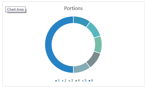
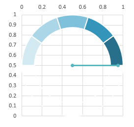
Remove the legend and the chart title and change the Angle of the First Slice to 270 degrees. Then select the Data Point associated with the value of 5 and choose no fill and no border:
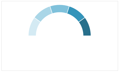
Now it is time to add the bar. When we add a XY series, Excel will add also the Horizontal and Vertical axis whose min and max we will set to 0 and 1 for both. This means the center of the doughnut will be at point X=0.5 and Y=0.5
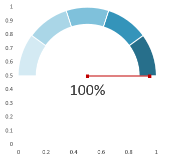
Our XY Scatter series then will contain two points, the first one which will be at X=0.5 and Y=0.5 and the second one which we will need to calculate. Assuming our progress will run from 0 to 100%, the angle at which the second point needs to be is: MOD((180 * percentage_Progress) + 270,360). Once we have the angle, we then calculate the radians using the Excel Radians function. From the radians then we calculate the Sine and Cosine which will be the X and Y of the second point. The Sine will be SIN(radians * 0.5 + 0.5) and the Cosine will be COS(radians * 0.5 + 0.5). I am adding 0.5 because I want the center to be at X=0.5 and Y=0.5 and I am multiplying by 0.5 because I want the radius to be equal to 0.5.
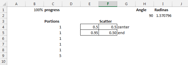
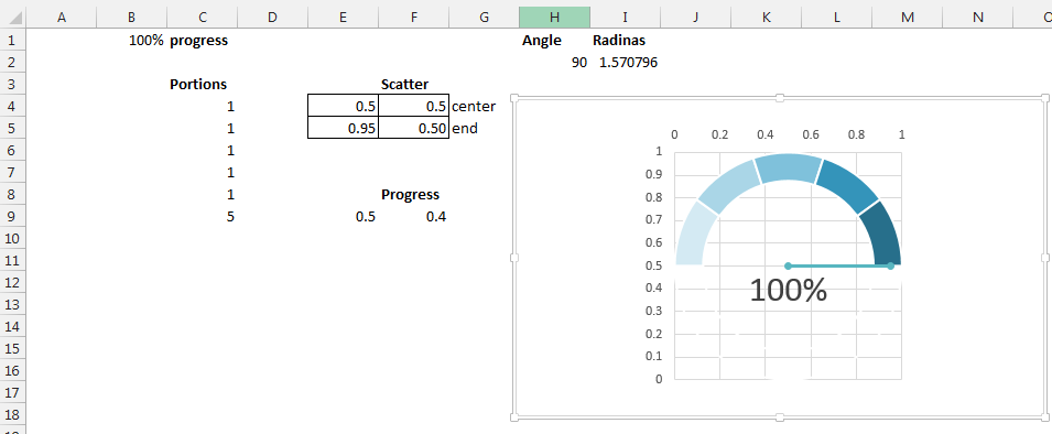
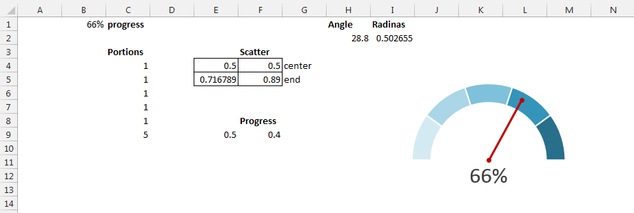
In B1 there is the progress, in H2 the formula: =MOD(270+(180*B1),360). In I2 the formula: =RADIANS(H2). In E5: =SIN(I2)*0.5+0.5 and in F5: =COS(I2)*0.5+0.5
Select the range E3:F5 and add the series as a XY scatter with straight line. Excel will add another circle to the doughnut by default, so you need to go to Change chart type and change this series to XY scatter with line and markers, then set the axis minimum and maximum to 0 and 1 for both the vertical and the horizontal axis:
Then I will add a separate XY series with coordinates X=0.5 and Y =0.4 in order to display the percentage in a data label:
Excel Gauge Chart
Now it is a matter of removing the Axis labels and the gridlines:
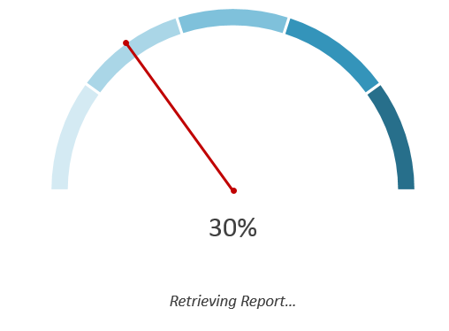
An original way of using the Gauge Chart
You can use this chart on an empty tab as a sort of progress bar for your macros running. You can add an additional XY series with coordinates X=0.5 Y=0.2 which you can use to show data labels as a message for the current step the macro is executing.
I hope you found this post useful and I hope it gave you some new ideas!