Excel Animated Sine Cosine Chart
While researching on the web yesterday I saw a nice animated chart showing the sine and cosine functions connected to each point of a circle which I thought would be a nice exercise to replicate in Excel:
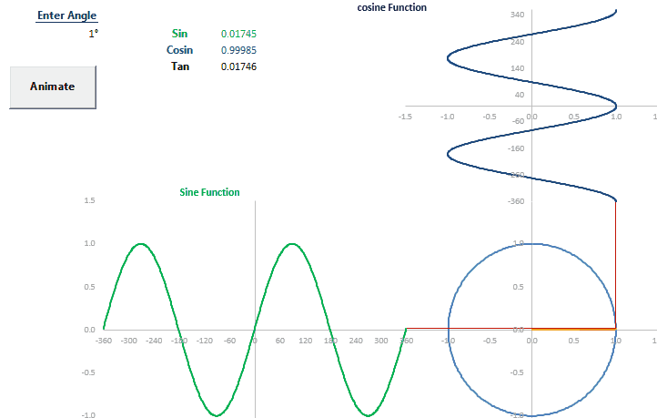
I am sharing the file that I used to build this along with the calculations. I am attaching two files, one that contains the above animation plus another one which also include a circle which gets filled dynamically with stacked areas:
EXCELLENT , REALLY PERFECT , THANK SO MUCH
Thank you!
How were you able to lap the charts in the group of charts to where the connections between the phaser and sin and cos waveforms? Great Spreadsheet!