Excel Clock Chart
When we look at a clock, we are looking at the first chart invented by the human kind, so why not build one in Excel? The steps are not that complicated and at the end is very satisfying. The process starts by building the following table:
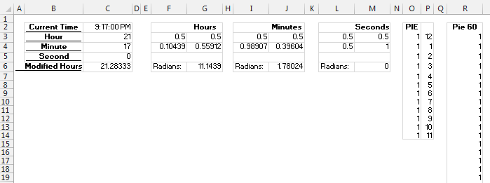
In cell C2 I have the current time by using the NOW function. And then I am extracting the Hour, Minute and Second in C3, C4, C6 by using the HOUR, MINUTE and SECOND functions. The value in C6 is the amount of hours to which I am adding the minutes divided by 60 in order for the Hour bar inside the clock to move smoothly from one hour to the next and not jump from one hour to the other suddenly each time the minutes have completed a turn. In F2 and G2 I have hard coded the value 0.5 which is the center of the clock, G6 I am calculating the RADIANS of the current angle of the HOUR, which basically is RADIANS(G6/12*360). Then in F4 and G4 I am calculating SIN and COSIN both multiplied by 0.4 (the radius I chose for the HOUR bar) and to which I am adding 0.5 (I want the center of the clock to be at point X=0.5 Y=0.5). Then I repeated the same steps for the Minutes and Seconds part (the only different is that I chose a radius of 0.5 for these as I want the bar to be longer than the HOUR’s). The data in column O and P are related to the Pie chart: I want 12 slices of the same size, while the data in column P are the labels for each slice. The data in column R is composed of 60 times the value of 1 (I want a pie chart of 60 slices of the same size). For the first pie chart I have chosen an explosion of 200% and an Angle of first slice of 345 degrees. The second Pie has an explosion of 400% and an angle of first slice of 345 degrees.
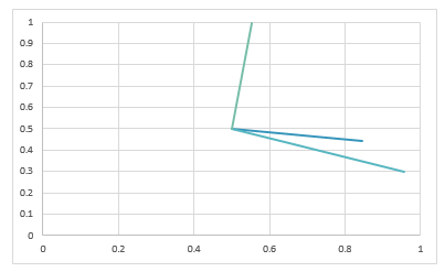
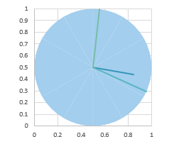
Add Hours, Seconds and Minutes series as XY series with line and no markers:
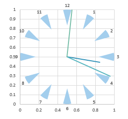
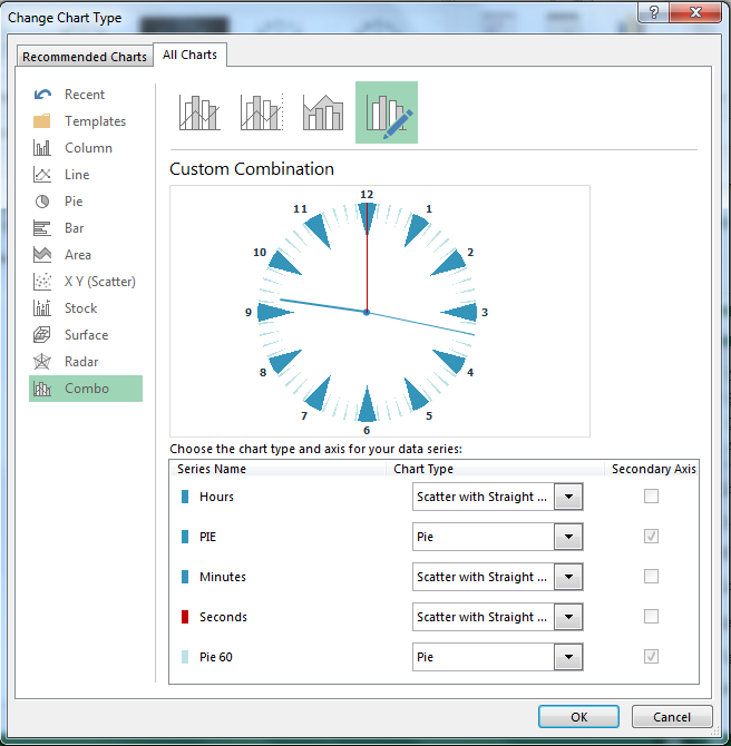
Add first Pie chart to secondary axis:
Add explosion of Pie chart of 200%, angle of first slice 345 and data labels:
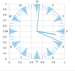
Add second Pie, explosion 400, angle of first slice 345:
Remove axis, gridlines and format the XY scatter as you like:
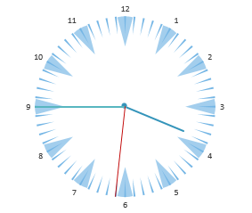
End Result:
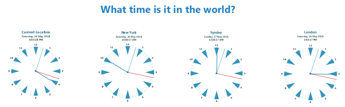
Retrieving the time for different cities
If we want to show simultaneously several clocks displaying the time of several cities we need to retrieve the exact time of each time. In order to do this I am first using a Windows function which returns the GMT Time and then an API function which tells the offset from the GMT for each city. Let’s go with order:
Retrieving the GMT Time
To retrieve the GMT Time, I used the below Windows function
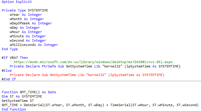
Now if you enter in Excel the function GMT_TIME you will get the current GMT Time.
Retrieving the GMT Offset
To retrieve the GMT offset I am using a web service API
I will pass to the request the latitude and longitude of a certain city and I get back an XML with different information including the GMT offset.
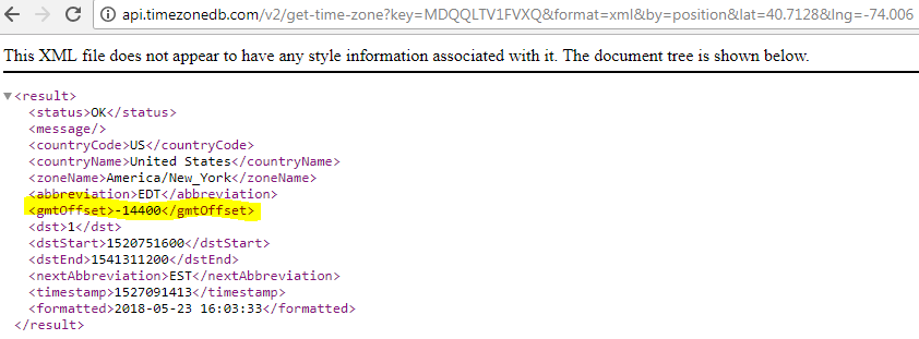
By looking at the above XML you are thinking why am I not using the value within the ‘formatted’ tag since the time is already there. The reason for this is that I do not want the query to refresh each second for each city, I will query the URL once when the workbook opens and then workout the time by adding the offset to the result of the Windows function which will be much faster.
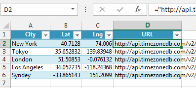
I set up a table with different cities and their lat and lng and a formula that builds the URL in the last column and named this table SetUp:
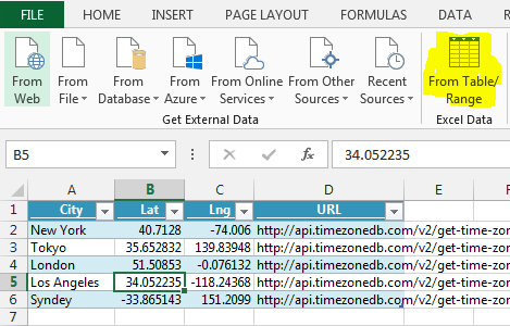
Once I have this table set up, I am using PowerQuery to retrieve the GMT Offset. So, with the table selected, I go to PowerQuery and chose ‘From Table / Range’:
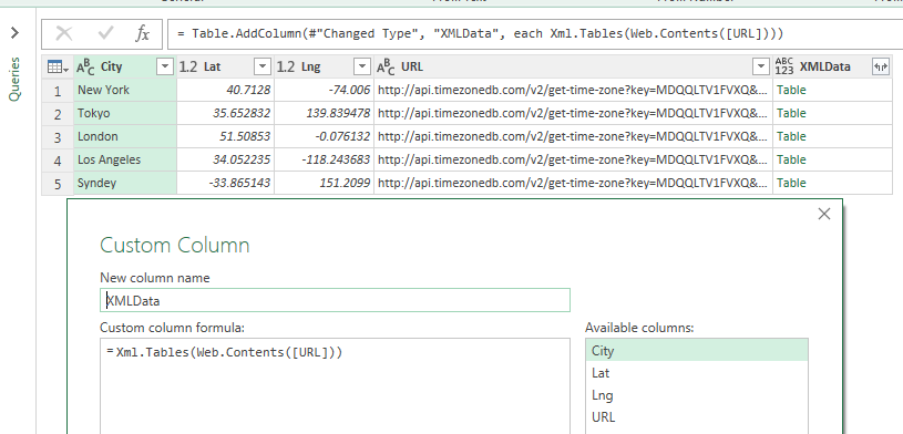
Once the data is loaded into PowerQuery, I will add a custom column:
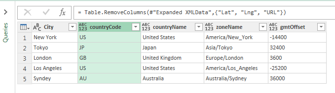
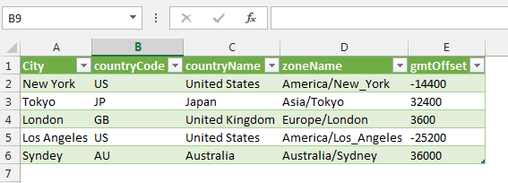
Then I will expand the XMLData Column and import it into an Excel Table:
To work out the time for a certain city I just needed to do: GMTTime + (gmtOffset / 86400). 86400 comes from 24*60*60 (hours * minutes * seconds)
Putting it all together
Once you have all the data it is easy to set up one chart per city and display several clocks at a time as I did below, or you could have just one chart linked to a slicer or a drop down to display the time a particular city:
Animating the charts
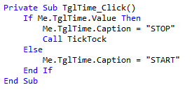
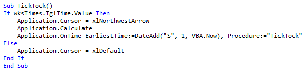
To animate the charts, I have added a toggle button with the following code which will call a routine called TickTock: