Scatter Chart for Countries Education Performance
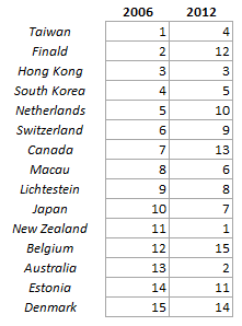
I found some interesting data on the OECD website ranking Countries Education Performance of 15 years old from one year to another which I thought would make an interesting Excel Scatter Chart.
The data set was something like the below:
Scatter Chart for Countries Education Performance
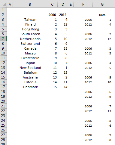
Rearranging the data
I rearranged the data in the following way to display it in a XY Scatter Chart.
Scatter Chart for Countries Education Performance
In F3 I placed the following formula in order to display a sequence of repeating years plus an #N/A every 3 rows:
=IF(MOD(ROWS(A$1:A1),3)=0,NA(),INDEX(C$2:D$2,MOD(ROWS(A$1:A1),3)))
In G3 I also the placed the following formula to sort of transpose the data for each country
=IF(ISNA(F3),NA(),INDEX($C$3:$D$17,QUOTIENT(ROWS(A$1:A1)-1,3)+1,MOD(ROWS(A$1:A1),3)))
Then I selected the #N/A cells and did clear contents in order to create a sort of break in the XY series between one country and another.
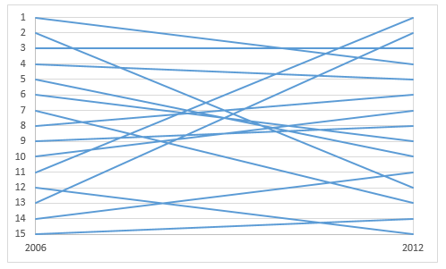
Adding the chart
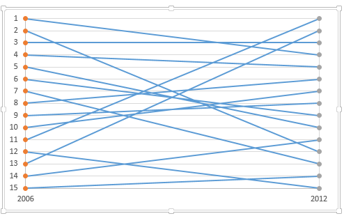
Select the range F2:G47 and add a Scatter with Straight Lines chart. Adjust the Min of the Horizontal Axis to 2006 and the Max to 2012, and the Major Units to 6. Select the vertical Axis and choose “Values in Reverse Order” and then Horizontal Asses Crosses at Maximum axis Value, then set the Min to 1 and the Max to 15 and Major Gridlines to 1.
Scatter Chart for Countries Education Performance
Adding left and right Country Labels
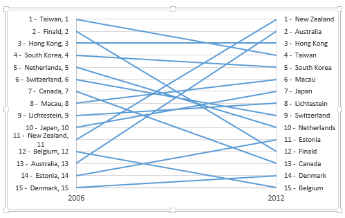
For the Country Labels I added 2 extra Scatter Series with Marker Only. The data for the series is the below:
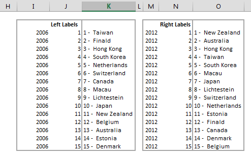
Select I2:J17 and add the first XY series, then M2:N17 and add the second XY series.
Scatter Chart for Countries Education Performance
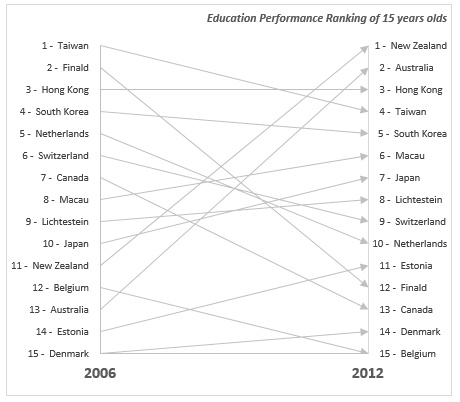
Hide the Vertical Axis Labels, then add data labels (data in column K for the first series and column O for the second series) for each of the 2 new series using Select Values From Cell in Excel 2013 or later, for earlier version of excel use Rob Bovey Chart Labeler
Scatter Chart for Countries Education Performance
Now we just need to fix the appearance. First thing is to choose a less aggressive color for the lines, I chose a light grey color and I chose an End Arrow Type for them. I also added a chart title and made the years bigger.
Scatter Chart for Countries Education Performance