The NORM.DIST Function
The NORM.DIST function, as its name implies, returns the normal distribution (continuous probability function) given the mean and the standard deviation of your observations. The NORM.DIST function can return two different probabilities depending on the last argument whether you set it to TRUE or FALSE. Suppose that your observations have a mean of 40 and standard deviation of 10, by doing NORM.DIST(X,40,10,FALSE) the NORM.DIST function will return the probability of the value X occurring, whereas NORM.DIST(X,40,10,TRUE) will return the cumulative probability of all the values less than or equal to X.
If 40 represented the average minutes a person watches TV per day, with a standard deviation of 10, and your friend came to you saying she watches only 20 minutes of TV per day, now you would know that the probability of her watching exactly 20 minutes of TV per day is NORM.DIST(20,40,10,FALSE) = 0.54%, whereas the probability of her watching maximum 20 minutes of TV per day is NORM.DIST(20,40,10,TRUE) = 2.28%, which means that the probability of her watching TV more than 20 minutes a day is 1-0.028 = 97.72%
The NORM.INV Function
The NORM.INV function is the inverse of the NORM.DIST function. Using our example above, if we wanted to answer the question: How many minutes of TV can I watch maximum per day to be in the bottom 10%, the answer would be NORM.INV(0.1,40,10) = 27.18 minutes, which also means that in order to be in the top 90% I must watch more than 27.18 minutes of TV per day.
Plotting the Normal Distribution in Excel
Before plotting the data, we need to remember the 68-95-99 rule which states that roughly 68% of the values lie between one standard deviation from the mean, in our example above, this translates that roughly 68% of the values lie between 30 and 50 (40 – 10 and 40+10), about 95% of the values lie between two standard deviations from the mean, in our example 95% of values lie between 20 and 60 (40-(10*2) and 40+(10*2), and about 99.7% of the values lie between 3 standard deviations from the mean, in our example between 10 and 70 (40-(10*3) and 40+(10*3). Thanks to this, I will choose the minimum and maximum of our X axis to lie between 4 standard deviations from the mean (0 and 80).
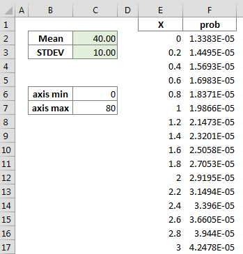
Excel Normal Distribution
In column E I have the placed all the values from 0 to 80 (stepping 0.2) and in column F the formula =NORM.DIST(E2,$C$2,$C$3,FALSE).
Finally, we are ready to select the data in column E and F and add our XY Scatter chart (I chose line with no markers)
Excel Normal Distribution
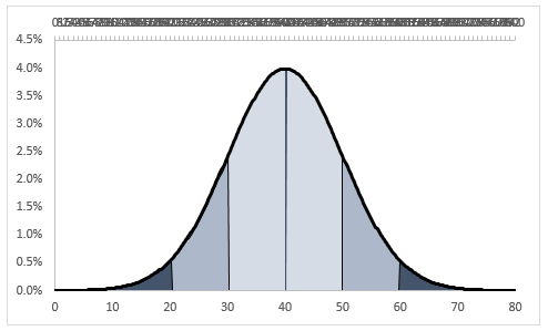
Adding more information to our chart
Now it would be nice to add 3 different areas to our chart: one that highlights the range that lies within one standard deviation from the mean, one that highlights the one that lies within two standard deviations from the mean and one that highlights the one that lies within three standard deviations from the mean.
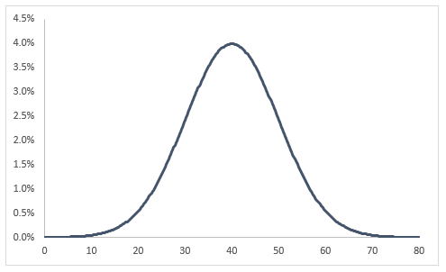
Adding the 68% area
We know that these values lie between 30 and 50 (40 – 10) and (40 + 10). This means that our series for the area needs to have 0 as Y values up until X = 30, then when X = 30 we will list 30 twice (one with Y value of 0 and one with Y value equal to the result of the NORM.DIST function), from 31 to 49 Y will be equal to the NORM.DIST function, and when X = 50 we will again list it twice, one with Y value of NORM.DIST and one with Y value of 0, finally for X > 50 we will have Y values of 0. Now, because eventually we will add this series to the secondary axis and we will chose a Date type axis, we will need to multiply all the X values by 10, because we need to have whole numbers without decimals in order for a date type axis to function properly.
After have built this series, we need to add it to the chart and then moving it to the secondary axis, changing the type of chart for the series to Area, make sure that the min and max of the secondary Y axis match those of the primary Y axis and adding the secondary horizontal axis, making sure it is a Date type axis whose min and max match those of the primary horizontal axis multiplied by 10. Then we need to get rid of the secondary vertical axis. After all these steps we are left with:
Excel Normal Distribution
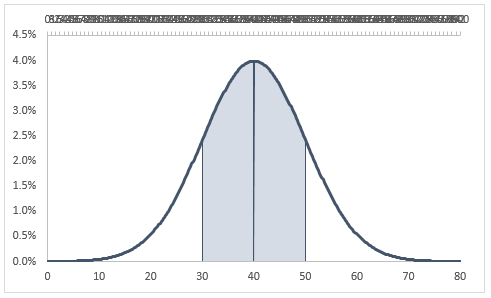
Adding the 95% area
The logic behind adding the second area is similar to the one above, but this time we will need the Y values of the area series to be equal to those of the NORM.DIST between X values of 20 to 30 and then between 50 to 60.
Then it is just a matter of again adding the series and following the same steps as above, but this time you do not need to modify the secondary axis values as they are already set:
Excel Normal Distribution
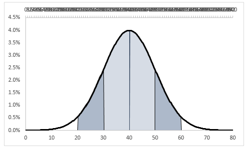
Adding the 99% area
Following the same logic as for the previous area, but keeping in mind now that the area needs to cover the values from 10 to 20 and from 60 to 70, we can build the other series and adding it to the chart as we did above.
Excel Normal Distribution
Further embellishments
Once we are at this stage, we could add at the bottom of the chart 3 XY series to highlight the width of each range. We will need to set the minimum of the Y axis to -0.03 and then hide the negative values by choosing a custom number format of 0.0%;;0%.
Our final graph:
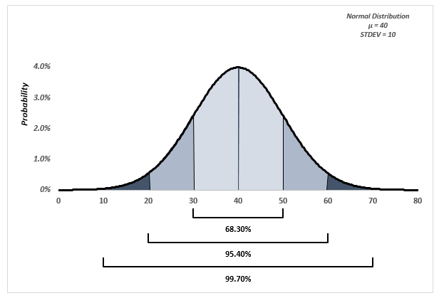
Excel Normal Distribution
You can experiment with it and add new information. Also you can check how the graph changes by changing the standard deviation: for lower values of standard deviation, you will notice that the chart gets more centered around the mean and the opposite happens for higher values of standard deviation.