Excel Forecast Charts
In the paragraphs below I will show how to calculate the different types of trendlines available in Excel charts: Linear, Exponential, Logarithmic, Polynomial, Power.
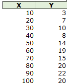
Given a data set like the below:
Excel Forecast Charts
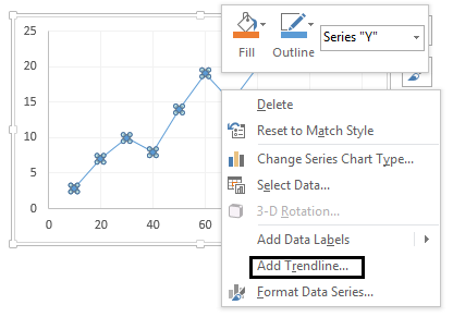
it is easy to add a XY Scatter chart and then show a trendline:
Excel Forecast Charts
Excel Forecast Charts
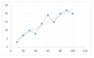
in the trendline options you can then change the type of trendline to another one (the default one is linear) and also add periods forward or backward. But what if we wanted to build a chart like the one below or if we were building a panel line chart? We cannot use this method to add our trendline and we will need to calculate it.
Excel Forecast Charts
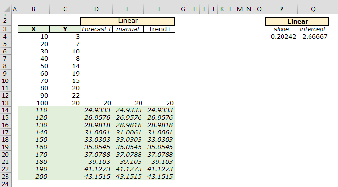
Calculating Linear Forecast
The calculation of the linear forecast is quite easy because Excel helps us with different functions. I will show three different ways you can calculate your trendline.
The first option you have is to use the FORECAST function. The FORECAST function will return the Y value corresponding to a given X value, given your original observations.
The second option is to build the equation manually: Y = bX + c where b is the SLOPE and c is the INTERCEPT. The slope and the intercept can be calculated using the LINEST function. The LINEST function is a great function and can be used to return different statistics.
The third method is using the TREND function.
Given the above data, the three methods are shown below:
Excel Forecast Charts
Where in D14, we have the formula =FORECAST(B14,C$4:C$13,B$4:B$13)
in E14 we have the formula: =B14*$P$4+$Q$4
in F14:F23 we have the array formula: =TREND(C4:C13,B4:B13,B14:B23,TRUE)
To calculate the slope and the intercept, we have the array formula in P4:Q4: =LINEST(C4:C13,B4:B13,TRUE,FALSE)
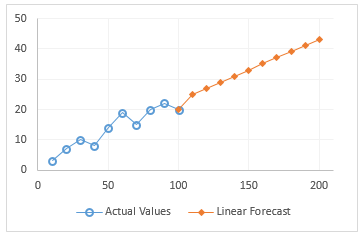
Once we have the above data it will be easy to build the below chart:
Calculating Exponential Forecast
For the calculation of the Exponential Forecast. We can use the GROWTH function. Or calculating manually using the equation Y = c * exp(b * X) where b is the SLOPE and c is the INTERCEPT. The slope and intercept are calculated a bit different than in the Linear forecast. You need to pass to the LINEST function the Logarithm of the Y values, the first value returned is the slope, whereas the exponential of the second value is the intercept (the LINEST function returns an array of values).
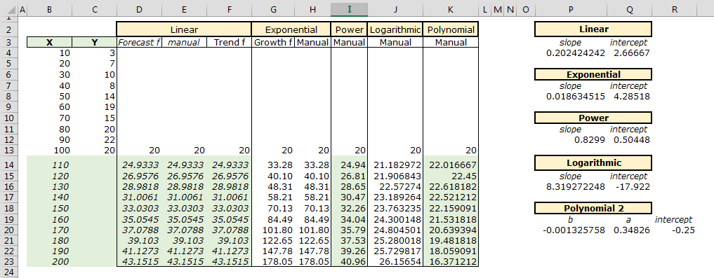
In G14:G23 we have the array function: =GROWTH(C4:C13,B4:B13,B14:B23,TRUE)
In H14 we have the manual calculation: =Q$8*EXP(P$8*B14)
In P8 we have: =INDEX(LINEST(LN(C4:C13),B4:B13,TRUE,FALSE),1)
and in Q8 we have: =EXP(INDEX(LINEST(LN(C4:C13),B4:B13,TRUE,FALSE),2))
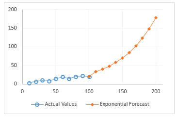
Finally we can build our chart showing the exponential trendline:
Excel Forecast Charts
Calculating Power Forecast
For the remaining three types we will need to use the respective equations to calculate our trendlines.
The equation for the POWER forecast is Y = c * (X ^ b) where b is the slope and c the intercept. The slope and intercept are calculated using the LINEST function where for the Known_X values we pass the logarithm of the X values and for the Known_Y values we pass the logarithm of the Y values, the first value returned is the slope, whereas the exponential of the second value is the intercept.
In I14 we have the formula: =$Q$12*B14^$P$12
in P12: =INDEX(LINEST(LN(C4:C13),LN(B4:B13),TRUE,FALSE),1)
in Q12: =EXP(INDEX(LINEST(LN(C4:C13),LN(B4:B13),TRUE,FALSE),2))
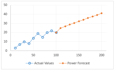
and our chart:
Excel Forecast Charts
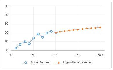
Calculating Logarithmic Forecast
The equation for the logarithmic forecast is: Y = b * LN(X) + c where b is the slope and c the intercept. The slope and intercept are calculated using the LINEST function where for the Known_X values we pass the logarithm of the X values, the first value returned is the slope, whereas the second value is the intercept.
In J14 we have the formula: =P$16*LN(B14)+Q$16
in P16: =INDEX(LINEST(C4:C13,LN(B4:B13),TRUE,FALSE),1)
in Q16: =INDEX(LINEST(C4:C13,LN(B4:B13),TRUE,FALSE),2)
and our chart:
Excel Forecast Charts
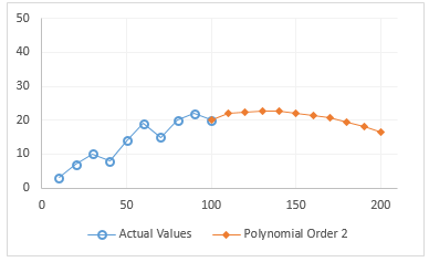
Calculating Polynomial Forecast
The equation for a Polynomial of order 2 is: Y= a*X + b*X^2 + z
The values a, b, z are also returned by the LINEST function:
Excel Forecast Charts
The range P20:S20 has the array formula: =LINEST(C4:C13,B4:B13^{1,2})
K14 has the formula: =SUMPRODUCT(P$20:Q$20,B14^{2,1})+R$20
If you wanted to make calculation for another order, say 5, you would select P20:U20 and enter the array formula: =LINEST(C4:C13,B4:B13^{1,2,3,4,5}) and in K14: =SUMPRODUCT(P$20:R$20,B14^{5,4,3,2,1})+S$20
Now we are ready to make the chart:
Excel Forecast Charts
Conclusions
I have used different trendlines for the same data set, of course this will not be the case in real life. Your data will have one trendline that best fit the observations, if given your data it makes sense to use a trendline. Normally it makes sense to use a trendline for values of R Squared close to 1. In my examples above where I use the LINEST function, you can set the last argument to TRUE and the function will also return the R Squared value (LINEST in this case will return an array, the R Squared value corresponds to the item in the 3rd row and 1st column, so to get the R Squared you would do =INDEX(YourLinestFunction,3,1))
Further reading: Choosing the best trendline for your data