Opswat Report
In this quick post I wanted to provide an alternative Excel market share chart to that found in the Opswat Report.
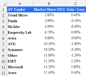
The data is shown below. It is a simple data table showing the Market share of each Antivirus and the % change from previous year:
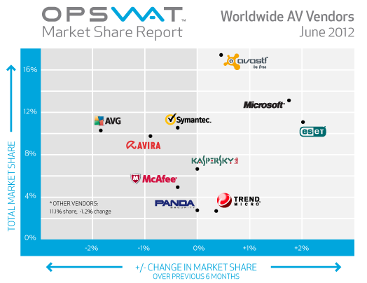
The chart proposed by the website is shown below:
Two Alternatives:
The first alternative is a panel bar chart which shows the Market share in the first panel and the % change in the second panel:
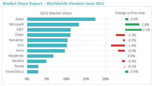 Excel Market share Chart
The blue series is on the primary axes, whereas the red and green are on the secondary axes. The min and max of the Horizontal value axis are 0 and 0.3 whereas the min and max of the secondary horizontal axes have been set to -0.125 and 0.025.
The other alternative follows the concept of the website chart where we have the %change on the horizontal axis and the market share on the vertical axis. I have made two versions, one that includes two areas which separate the negative from the positive changes and one without:
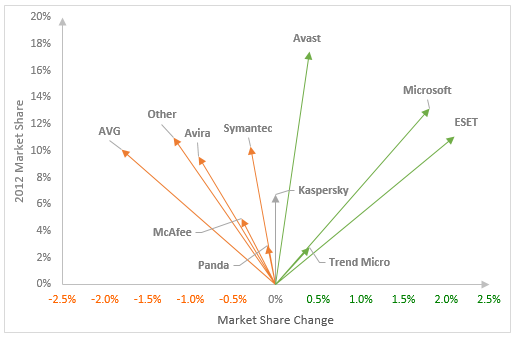
Excel Market share Chart
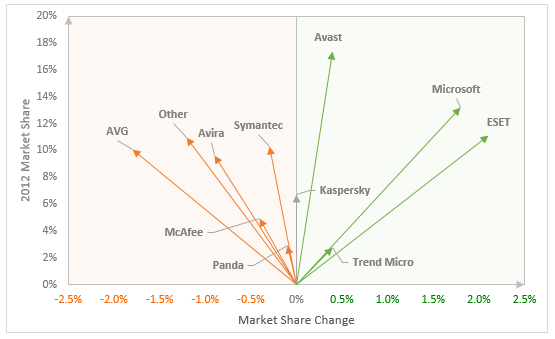
Excel Market share Chart
How would you display this data? Another idea could be a dot plot sorted by market share which shows two series, one for 2012 and one for 2011