Panel Bar Chart
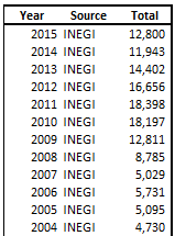
The other day I came across a data visualization website which inspired me to replicate some of the graphs in Excel. The data shows gunfire homicides in Mexico between 2000 and 2015 by 2 different sources (plus an extra category for the difference between the two) from which I made a panel bar chart.
The link to download the file is: Click to Download the file
Organizing your data
Adding the graph using the raw data would result in a messy graph not so easy to read. The first step is to organize your data to allow for a panel chart:
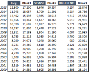
As you have noticed, I have added 3 extra series, each one being my preferred Y axis maximum (30,000) minus each record. Hence Blank1 = 30,000 – 12,800 etc
Adding the chart
Select the above table and add a stacked bar chart:

The next step is to choose “No Fill” for all the “Blank” series

I also deleted the legend and changed the max of the horizontal axis to 90000.
Adding extra series
The next step is to add an XY Scatter series next to the horizontal axis to show a data sequence of 0k, 10k, 20k – 0k, 10k, 20k – 0k, 10k, 20k. To do this you need to create the below data set:

Panel Bar Chart
Select the data and copy. Then select the chart and choose paste special. You want to add a New Series, with Y values in columns, Series Name in First Row and Categories (X) in first Column. After adding the series, select the chart and go to Change chart type. Turn the newly added series into XY Scatter. You will end up with something like the below (points perfectly aligned where we want them):

Panel Bar Chart
Now we need to add proper labels for this series. First thing is to select the series, right click and choose “Add Labels”. Then select the labels, do CTRL+1 to open up Chart Editing box and go to Label Options. Here you want to select Add Value From Cells. And Select the bells in Yellow:

Panel Bar Chart
This method of adding data labels will work on Excel 2013 and after. For earlier versions of excel I advise you to use this chart labeler add-in:
To add the series name on top of the chart, you want to do the same thing using the below data series (making sure the secondary vertical axis goes from 0 to 1):


Panel Bar Chart
Clean up the clutter
Once you are at this stage, it is just a matter of making your chart look nice. Remove the secondary vertical and primary vertical axis. Hide the markers of both the XY Series. Make sure the vertical major gridlines are at an interval of 10k. Select the series of choose a gap width of 30%. Adjust the colors. Add data labels for the blank series by using as labels values the value of the series below. At the end you will end up with something like this.

Panel Bar Chart
The chart is now neat and clean and shows the data in a clear manner. Let me know your ideas in the comments below. How would you display this data?