Dynamic Pareto Chart in Power BI
In this post I want to share my technique of building a dynamic Pareto Chart. Pareto charts are used to show the 80/20 rule according to which roughly 80% of the effects come from 20% of the causes.
As a data set for this post I will use the usual AdventureWorks Data warehouse.
Data Model
After importing the Sales, Date, Customer and Product tables, you are left with the simple star schema:

Building the Matrix
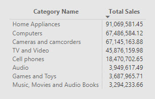
I will build the visual based on the Product Category. The first step to test if our measure gives us the right numbers is to add a matrix visual and drop the Product Category on the rows section and creating the Total Sales measure:
1 | Total Sales = SUMX( Sales, Sales[Net Price] * Sales[Quantity] ) |
and sorting the matrix in Descending order by Total Sales (I have also switched off the Total Rows as they are not needed)
Now we can start building the Cumulated % measure. The first step is to find out which categories have a Sale Amount which is greater than the value displayed in the current filter context. In order to handle categories which could have the same Total Sales amount, we also need find out which categories have a Total Sales amount equal to that displayed in the current filter context but whose Category Name comes alphabetically before the current Category displayed in the matrix. This is accomplished by the following DAX:
1 2 3 4 5 6 7 8 9 10 11 12 13 14 15 | = FILTER ( ALL ( 'Product'[Category Name] ), VAR TableRowSale = [Total Sales] VAR MatrixRowSale = CALCULATE ( [Total Sales], VALUES ( 'Product'[Category Name] ) ) RETURN OR ( TableRowSale > MatrixRowSale, AND ( TableRowSale = MatrixRowSale, 'Product'[Category Name] <= SELECTEDVALUE ( 'Product'[Category Name] ) ) ) ) |
Once we have this table, we can easily calculate the cumulated Total Sales:
1 2 3 4 5 6 7 8 9 10 11 12 13 14 15 16 17 18 | = CALCULATE ( [Total Sales], FILTER ( ALL ( 'Product'[Category Name] ), VAR TableRowSale = [Total Sales] VAR MatrixRowSale = CALCULATE ( [Total Sales], VALUES ( 'Product'[Category Name] ) ) RETURN OR ( TableRowSale > MatrixRowSale, AND ( TableRowSale = MatrixRowSale, 'Product'[Category Name] <= SELECTEDVALUE ( 'Product'[Category Name] ) ) ) ) ) |
And finally divide it by the Total Sales of all Categories:
1 2 3 4 5 6 7 8 9 10 11 12 13 14 15 16 17 18 19 20 21 | Cumulated % = DIVIDE ( CALCULATE ( [Total Sales], FILTER ( ALL ( 'Product'[Category Name] ), VAR TableRowSale = [Total Sales] VAR MatrixRowSale = CALCULATE ( [Total Sales], VALUES ( 'Product'[Category Name] ) ) RETURN OR ( TableRowSale > MatrixRowSale, AND ( TableRowSale = MatrixRowSale, 'Product'[Category Name] <= SELECTEDVALUE ( 'Product'[Category Name] ) ) ) ) ), CALCULATE ( [Total Sales], ALL ( 'Product'[Category Name] ) ) ) |
After adding Cumulated % to the matrix you are left with:

Building the Visual
We are now ready to build our visual. Add a ‘Line and Clustered Column’ visual, drop the Category Name into the ‘Shared Axis’, the Total Sales into the Column Values and the Cumulated % into the Line Values. Go to the formatting options of your visual, and make sure that the line Y axis starts at 0 and ends at 1:

Apply your preferred colors and formatting and you are left with:
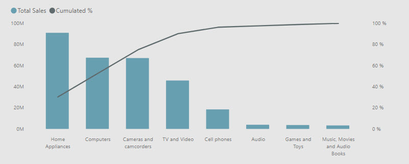
The chart will be fully dynamic and can be easily filtered by any attribute such as Year, Product Color, Customer Education and so on.
What is your technique of building a Pareto chart in Power BI? Do you know of any custom visual which can make our lives easier?
Books that have helped me a lot in my DAX journey:
Hi there! Such a great article, thank you!
Hi Leon – thank you for the feedback!
Excellent, it has been VERY helpful. I’ve been looking for hours to find a solution for a Dynamic Pareto Chart on Power BI that does not mess up with dates.
However, just want to indicate that there is a typo in one of your formulas which was making me get an inverted chart.
In the Total Sales of all Categories, line 12 it should be :
TableRowSale < MatrixRowSale,
"”
Otherwise that is perfect !
Thank you Paula! Your feedback is appreciated!
Timely, and good information. I am using this with a total qty, not sales. There are several that are the same qty, and resulting in the same cummulated%. I cannot determine how to “fix” this. Any insight? Thank you.
Hi Teresa!
Normally what you’d need to modify is:
Total Sales = SUMX( Sales, Sales[Net Price] * Sales[Quantity] )
To
Total Quantity = SUM(Sales[Quantity])
and then use [Total Quantity] in the final measure instead of [Total Sales]
This change does not provide the correct results?
This is exactly what I was looking for. Thank you so much for this post.
Thank you for the kind words, Jamie!
Hey Livio. Great article!! But how would you do this with a count? I tried switching the sum out for count and I get nothing but 100%s. Wondering your thoughts. Thank you!
Hi Livio,
This is a wonderfully detailed guide. Thank you very much for sharing this with everyone.
If I have a long list of categories, is there a way that I could dynamically rank the categories per year and then group any categories that fall outside the top 20 into an ‘Others’ group instead of them all being displayed.
Any way to have a lot of customers represented on the X-Axis as percentage of all customers? So X-Axis is 0-100% of customers compared to 0-100% of revenue. I managed to create this using calculated columns, but that makes it static.
Your method is great for small number of entities on the x-axis but not for pareto on 500 customers.
If I have two or more values that are equal the cumulative percent for those values is also equal so I get a stepped appearance to my pareto line. Is there a way to fix this?
Hi suppose there is product subcategory, can i drill down from product category to sub category and get pareto for every category seperately.
i meant pareto for every category where the x axis is the name of all the subcategories in that category.
i need to drill down from product category to sub category automatically
Thank you very much Livio! Works a treat. I tried at least 6 other guides before finding this one and none of them were dynamic and included all filter contexts like this.
Thank you for your feedback Geoff!
is there any way to filter only top 5 ?
Excelent. This is what I needed. It worked perfectly. Thank you so much
Thank you, Juan!